Demand is the willingness and ability for someone to pay for an item. If they can't pay for it or don't want it then the person does not have a demand for it. No matter how much they want it.
The amount of an item people are willing to buy at various prices can be shown on a demand schedule or a demand curve.
Both show the same information.
Demand schedules display the data in a chart.
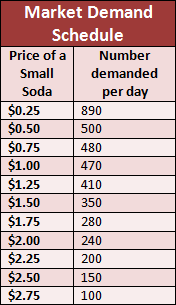
Demand curves display the data in a graph

That is the only difference. Just how the info is shown.
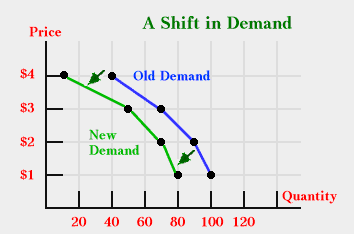
The demand can shift though! Things outside of the price can affect how much people will buy of an item at any price.
There are 6 main things that can cause a shift in demand.
Market size- Number of potential buyers change
Consumer tastes- Popularity increases demand
Consumer expectations- Possible future prices affect present buying
Substitute goods- Products are interchangeable
Complementary goods- Products are used togetherFor example: If people have less money to spend on products, then the demand curve will shift because they will be less willing to buy the same amount of a product at all of the prices.
Like this.
I like how you pointed out that this week we learned that there are different ways to explain something. There are easier ways to show demand changes than others. I also liked how you explained how the changes listed above are what changes the graph. The 6 main factors were nicely summed up in your blog as well. I think that it was good you emphasized the consumers have the control over how much demand there will be.
ReplyDeleteI like your clear and concise charts. They make it easy to visualize just how demand works. I think it's pretty neat how the choices of consumers can be shown through mathematical means.
ReplyDeleteThis blog is amazing Dominic it lays everything out in a clear order has amazing charts that display and teach what you are describing, and is just all inn all super informative god job with the blog.
ReplyDelete